
Install
Inside DeepSeek Harness, with dsh-market
dsh plugin --profile web add dshmarket
Or from the command line
dsh plugin --profile web add dsh-theme-manager
Installing runs third-party code with your own permissions — it can read your files, use your credentials and reach the network. Review the source first, and pin a commit (github:owner/repo#sha) when you can.
README
A two-level theme manager for the DeepSeek Harness Web UI: pick a culture / scene first, then a concrete style.
中文说明: README.md
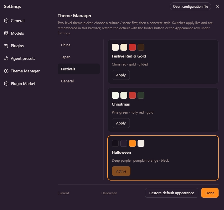
Features
- Two-level picker: Settings → Theme Manager (a
settings.sectionpage) — category list on the left, style cards (with color swatches) on the right. - Applies live: every style is registered as a real theme through the
themeservice (--dsw-alias-*token overrides) — click Apply and the UI re-skins instantly, no refresh. The styles also appear as extra color cubes in the built-in Appearance row. - Remembered: the active style is kept in the browser's localStorage (
dsh.themeManager.active) and restored on reload; switching back to a built-in appearance (Light / Dark / System) clears it. - Bilingual: copy follows the UI language via the
localeservice (zh / en). - Update reminders: checks npm for a newer version on boot and every 6 hours; a one-time toast and a persistent pill appear bottom-right, and the settings page offers one-click update / ignore this version / remind me later. npm and GitHub installs can update in one click (the host half runs
dsh pluginand restarts automatically); developmentlink:installs get guidance instead.
Built-in styles
58 styles are bundled (23 culture / scene + 8 developer + 7 high-contrast + 20 national flags; 37 light-base · 21 dark-base).
Culture / scene (layer 1: China / Japan / Festivals / General)
| Layer 1 | Style | Palette |
|---|---|---|
| China | Ink Wash | Rice-paper white · ink-black primary · vermilion accents |
| China | Suzhou Garden | White walls & dark tiles · bamboo green |
| China | Forbidden City | Vermilion walls · gilded accents |
| China | Azure Landscape | Mineral blue · malachite green · ochre |
| China | Guochao Neon 🌙 | China red · neon cyan on ink night |
| China | Blue-and-white Porcelain | White glaze · cobalt blue · gilded accents |
| China | Dunhuang Flying Apsaras | Mural ochre-red · malachite green · lapis · earth yellow |
| Japan | Ukiyo-e | Washi ivory · ultramarine primary · ochre-red & mustard |
| Japan | Wabi-sabi | Muted rice-grey · zen minimalism |
| Japan | Sakura | Cherry-blossom pink · white · fresh green |
| Japan | Edo Night 🌙 | Indigo night · paper-lantern amber |
| Japan | Tokyo Neon 🌙 | Neon pink · electric cyan |
| Festivals | Festive Red & Gold | China red · gold · gilded |
| Festivals | Christmas | Pine green · holly red · gold |
| Festivals | Halloween 🌙 | Deep purple · pumpkin orange · black |
| General | Cyberpunk 🌙 | Neon magenta · electric cyan on black |
| General | Midnight Minimal 🌙 | Pure black-grey · high contrast |
| General | Forest | Deep green · moss · cream |
| General | Ocean Breeze | Sea blue · white · teal |
| General | Morandi | Soft muted greys |
| General | Retro Film | Warm brown · faded amber |
| General | Starry Night 🌙 | Deep blue-violet · starlight |
| General | DeepSeek Deep Blue | Sea-mist white · deep-sea blue · teal accents |
🌙 = dark base (
colorScheme: "dark"); the rest use a light base.
Developer (layer 1: Developer)
Faithful dark themes from official palettes (great for coding / long sessions):
| Layer 1 | Style | Palette |
|---|---|---|
| Developer | Catppuccin Mocha 🌙 | Mauve · midnight navy · cream |
| Developer | Dracula 🌙 | Deep purple-black · violet-pink · emerald accents |
| Developer | Tokyo Night 🌙 | Indigo night · electric blue · neon cyan |
| Developer | Nord 🌙 | Polar night · glacier frost · aurora green |
| Developer | Gruvbox 🌙 | Warm black · wheat yellow · retro orange |
| Developer | One Dark 🌙 | Slate grey · electric blue · muted syntax colors |
| Developer | Solarized Dark 🌙 | Deep teal-black · scientific cyan-blue · restrained |
| Developer | Ayu Mirage 🌙 | Dune blue-grey · sky blue · soft teal |
High Contrast (layer 1: High Contrast)
Bold complementary / high-saturation pairings: a near-black or near-white neutral base carries the UI while loud accents hit buttons and highlights — striking contrast without eye strain:
| Layer 1 | Style | Palette |
|---|---|---|
| High Contrast | Black & Gold 🌙 | Obsidian black · gilded gold · candle-light text |
| High Contrast | Red & Black 🌙 | Ink black · signal red · pure-white secondary |
| High Contrast | Yellow & Black 🌙 | Obsidian black · safety yellow · monochrome secondary |
| High Contrast | Pink & Black 🌙 | Obsidian black · hot pink · pure-white secondary |
| High Contrast | Acid Green 🌙 | Dark green-black · acid lime · mint teal |
| High Contrast | Teal & Orange 🌙 | Ink teal · flame orange · electric teal secondary |
| High Contrast | Mondrian | Off-white · primary red-yellow-blue blocks · black grid |
National flags (layer 1: Flags)
Two-color flags (Japan, Indonesia, Saudi Arabia, Switzerland, …) are handled by the flagSpec() generator: it derives every surface layer / label / border / state color from the flag's signature colors by tinting and shading.
| Layer 1 | Style | Palette |
|---|---|---|
| Flags | United States | Stars & Stripes: navy · red · white |
| Flags | China | Five-star red flag: red · gold |
| Flags | Germany | Black · red · gold |
| Flags | Japan | Rising sun: white · red |
| Flags | India | Saffron · white · green · navy |
| Flags | United Kingdom | Union Jack: navy · white · red |
| Flags | France | Blue · white · red |
| Flags | Italy | Green · white · red |
| Flags | Canada | Maple leaf: red · white |
| Flags | Brazil | Green · yellow · blue |
| Flags | Russia | White · blue · red |
| Flags | South Korea | Taegeukgi: white · red · blue · black |
| Flags | Mexico | Green · white · red |
| Flags | Australia | Southern Cross: navy · white · red |
| Flags | Spain | Red · gold |
| Flags | Indonesia | Red · white |
| Flags | Turkey | Crescent: red · white |
| Flags | Netherlands | Red · white · blue |
| Flags | Saudi Arabia | Green · white |
| Flags | Switzerland | Cross: red · white |
Installation
Requires dsh web 0.1.0-rc.6 or newer.
Option 1 — install directly from GitHub (recommended)
dsh plugin installs the dependency into the profile and appends it to dsh.profile.bundles automatically — no manual config:
dsh plugin --profile web add github:runcat-tommy/dsh-theme-manager
Or with the full git URL:
dsh plugin --profile web add https://github.com/runcat-tommy/dsh-theme-manager.git
After the install, restart dsh web and open Settings → Theme Manager.
pnpm is required:
npm i -g pnpmif you don't have it (dsh pluginforwards to pnpm).
Option 2 — npm install (once published to npm)
dsh plugin --profile web add dsh-theme-manager
Restart dsh web afterwards.
Option 3 — manual download / source install (development)
Get the source: on the GitHub repo page use Code → Download ZIP, or
git clone https://github.com/runcat-tommy/dsh-theme-manager.gitEnter the source directory and install it directly:
cd dsh-theme-manager
dsh plugin --profile web add .
dsh plugin add .resolves the current directory to an absolute path and installs it as afile:snapshot. For live development — where you want source edits to apply instantly — use the symlink form instead:dsh plugin --profile web add link:.Alternatively, edit
~/.dsh/profiles/web/package.jsonmanually:{ "dependencies": { "dsh-theme-manager": "link:D:/path/to/dsh-theme-manager" }, "dsh": { "profile": { "bundles": [/* …existing… */, "dsh-theme-manager"] } } }Then run
pnpm installinside~/.dsh/profiles/web.Restart
dsh web.
Usage
- Open Settings → Theme Manager.
- Pick a layer-1 category on the left (China / Japan / Festivals / General), then click Apply on a style card — the UI re-skins instantly.
- The choice survives a page reload; to go back to the default, click Restore default appearance at the bottom, or switch Light / Dark / System in the Appearance row.
Update reminders
The plugin checks npm for the latest version on boot and every 6 hours (or hit Check for updates at the bottom of the settings page). When a newer version is found:
- A one-time toast appears bottom-right (click View to open the update dialog); a persistent pill stays until handled or ignored.
- The dialog shows the version diff and changelog, with Ignore this version / Remind me later (24 h) / Update.
- Update: npm installs pin
dsh-theme-manager@<new version>; GitHub installs resolve the latest commit and pin its SHA. Progress and the install log stream live, then the dialog offers a restart (one-click where auto-restart is allowed, manual steps otherwise). - On boot after the restart, the pending target version is verified: success shows "Updated to vX.Y.Z", failure surfaces retry / rollback in the settings page.
- Rollback: the previous install source is recorded automatically, so you can go back to the previous version in one click.
Development
link:installs and fully manual installs cannot update in one click — the dialog explains what to do instead (forlink:, update the source and restart).
Adding a new style
Append an entry to the STYLES array in lib/client.js (and add CATEGORIES plus zh / en copy). Each style declares a compact spec (~30 core colors); palette() expands it into the full --dsw-alias-* token map:
{
  id: "suzhou-garden",          // unique id (must not collide with light/dark/system)
  category: "china",            // owning layer-1 category
  colorScheme: "light",         // base palette: "light" or "dark"
  labelKey: "style.suzhouGarden",
  descKey: "style.suzhouGardenDesc",
  swatch: ["#…", "#…", "#…", "#…"],   // card preview swatches (base / layer2 / brand / label1)
  spec: {
    base: "#f4f1e8", layer1: "#faf7ef", layer2: "#efead9", layer3: "#e5dec8",
    overlay: "#fdfbf4", platform: "#efe9d7",
    label1: "#2f2f2a", label2: "#56544a", label3: "#7d7a6c", dimmed: "#a9a491",
    onDark: "#faf7ef",              // text color on primary buttons (near-white for light, near-black for dark)
    brand: "#4a7c59",
    btnPrimary: "#2f2f2a", btnPrimaryHover: "#46443c", btnPrimaryDimmed: "#e2dcc6",
    btnInfo: "#4a7c59", btnInfoHover: "#5b8f6a",
    brandTertiary: "#dce6d4",
    error: "#a34a32", error2: "#c05a3e",
    success: "#3f7a4e", success2: "#55906a", success3: "#dce8d2",
    warn: "#a8762e", warn2: "#c2913f", warn3: "#f0e3c2", warnLabel: "#8a5f1f",
    bubble: "#e8e2cf", bubbleHi: "#dcd4b8",
    sidebar: "#eee9d8", sidebarActive: "#e3dcc4", sidebarAccent: "#c6bb97", sidebarHover: "#e9e3cf",
    toast: "#2f2f2a"
  }
}
Token names and semantics follow the alias layer of @deepseek-ai/dsh-client-ui-theme (lib/styles/design-platform.css).
Layout
dsh-theme-manager/
├── assets/                # preview images (referenced by the READMEs)
├── package.json           # dsh.client declaration (web platform: browser half + host half)
├── cordis.patch.yml       # bundle patch: contributes one profile row
├── README.md              # Chinese docs
├── README.en.md           # English docs
├── DESIGN.md              # update-reminder design doc (zh)
├── DESIGN.en.md           # update-reminder design doc (en)
├── test/                  # host route-guard tests + client smoke test (node --test "test/*.test.mjs")
└── lib/
    ├── index.js           # host half: updater routes (info / update / rollback / restart)
    └── client.js          # browser half: styles + registration/restore + picker UI + update-reminder UI
Roadmap
- Ink Wash (China) / Ukiyo-e (Japan) sample
- Expanded to 20 culture / scene styles (China 5 · Japan 5 · Festivals 3 · General 7, incl. 7 dark-base)
- Flag series: 20 countries (two-color flags get their full palette derived by tint/shade)
- Update reminders (v1.1.0: npm version check + one-click update / ignore / rollback + host half)
- 8 developer themes (Catppuccin / Dracula / Tokyo Night / Nord / Gruvbox / One Dark / Solarized / Ayu) + Blue-and-white Porcelain / Dunhuang + DeepSeek Deep Blue (v1.2.0: 51 styles)
- High-contrast series of 7 (Black & Gold / Red & Black / Yellow & Black / Pink & Black / Acid Green / Teal & Orange / Mondrian) (v1.3.0: 58 styles)
- Configurable style list (JSON-defined, no code changes)
- light / dark dual-base for every style
- Texture enhancement (rice paper, gilded foil, wave patterns, …)
Comments
Comments live in GitHub Discussions. Sign in with GitHub to post or react.